0
7
Reporter - Allocations
Global User Research / Product Strategy / Product Definition / Prototype / Enterprise Application
Redesign of enterprise workforce management tool.
My Role: UX Research & Design, Prototype Team: UX Manager, 3 UX Designers, Engineering Team Methods: Ecosystem Map, Stakeholders Interviews, Use Cases and Scenarios, Usability Testing, Prototyping Tools: Figma, Framer, React, Google Sheets, Zoom
Context
R/GA is a prominent global digital agency with a team of over 2,000 professionals worldwide. To efficiently manage our international operations, R/GA utilizes its proprietary workforce management tool, Reporter.
This vital application encompasses critical workflows such as:
- Hiring and HR
- Resource Management (Allocations)
- Timesheets and Time Off
- Project Management
- Business Intelligence and Reporting.
Reporter is the backbone of the organization, ensuring seamless and efficient business processes.
Ask
Update a legacy application.
Redesigning and rebuilding this 20-year-old workforce management app was a significant challenge. Due to limited time and resources, our team couldn't tackle a full redesign at once. During the discovery phase, I helped identify the key feature to focus on for an MVP that addressed some of R/GA's most pressing pain points for users, the business, and the product.
The Challenge
- Understand R/GA's current use of the app.
- Determine the top feature to revamp for the new app's initial version.
- Partner with users and stakeholders to redesign and launch this feature.
Discovery
User Research
I was involved in a global design research initiative to explore the company’s current use of the app. We interviewed more than 20 users worldwide, including representatives from the US, LATAM, EU, and APAC, spanning various core departments and levels of experience. Our research concentrated on the business’s most critical workflows, particularly those affecting daily project management.

Users interviewed from around the globe.
Synthesising UX Research
With a clear focus on the big picture, our team prioritized one feature for the initial relaunch. I contributed to synthesizing our discovery findings, focusing on critical pain points for users, the business, and the app's health.
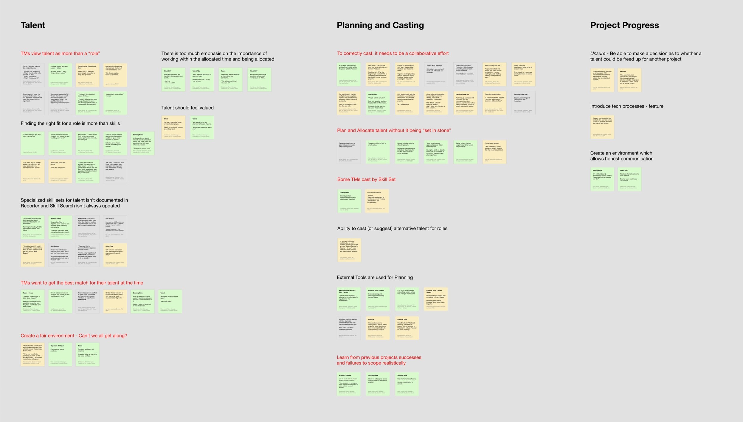
Collecting and organizing Clues from user interviews
Grouping Clues into Themes.
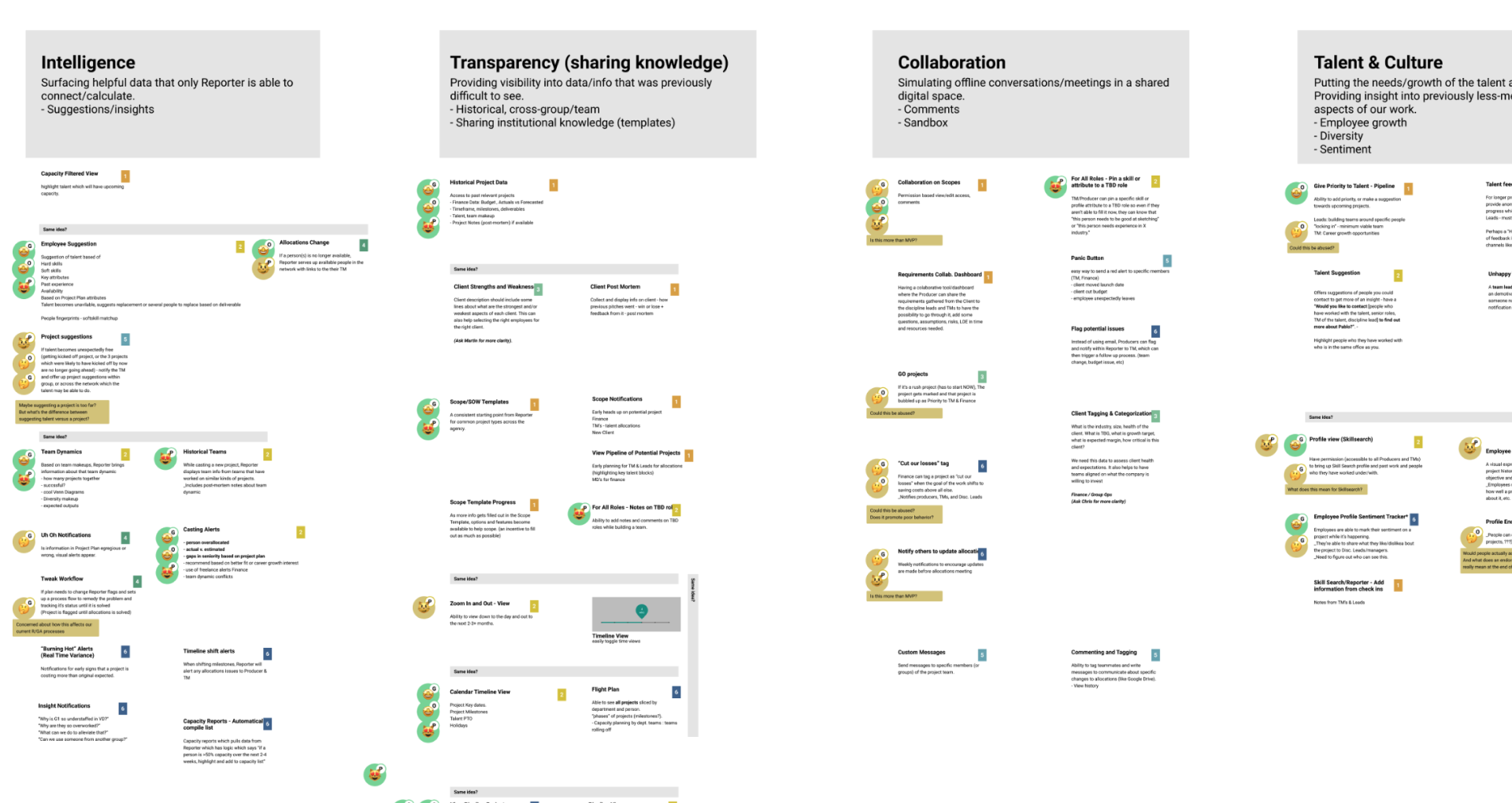
Dot-voting on early ideas with the entire product team.
Insight
Allocating resources to projects required the most focus.
Allocations is the process of getting the right people on the right projects at the right time.
Allocations is the process of getting the right people on the right projects at the right time.
Talent Managers oversee this process, aiming to maintain a balanced workload for all agency personnel across client engagements.
The Problem with Allocations
The old app did not meet the needs of Talent Managers.
Some issues were:
- Overwhelming and dense with data.
- Inflexible, unresponsive, and slow.
- Lacking in “humanity.”
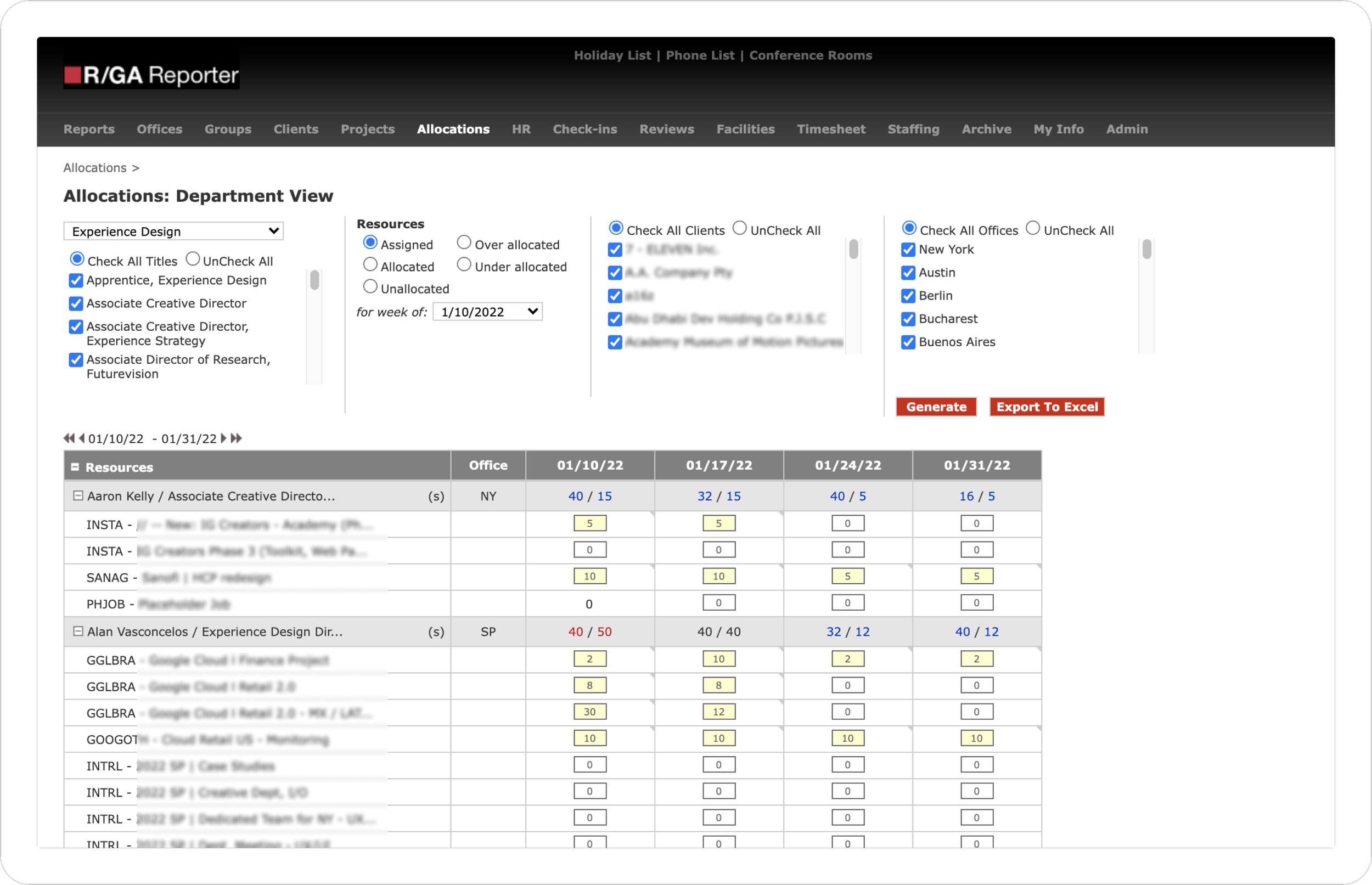
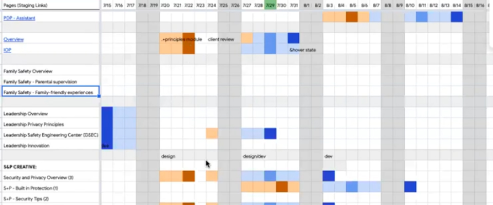
Original interface.
Requirements
Talent Managers use spreadsheets instead of Reporter, keeping critical information external. R/GA lacked a means to obtain accurate allocation data. We needed to steer users back to the app.
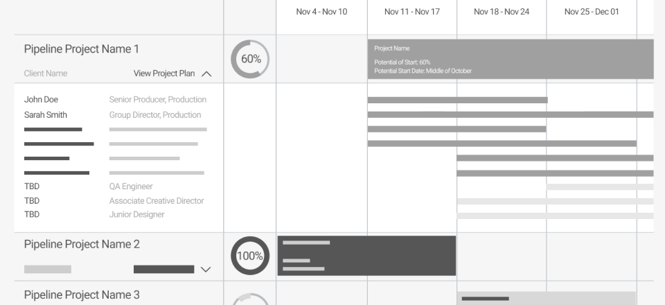
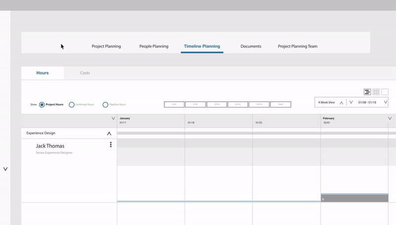
Initial low fidelity designs & prototypes to explore potential key features.
Opportunity
Restore confidence in a “source of truth” for Allocations.
By redesigning the Allocations section of the app with all necessary features, Talent Managers can utilize a single hub for accurate data.
Design Challenge
How can we create an experience that Talent Managers prefer over using spreadsheets?
We observed Talent Managers using their spreadsheets and discussed what they preferred about the sheets over the app.
Ultimately the spreadsheets provided:
- A way for users to more easily visualize project assignments.
- A flexible and easily customizable view of different teams.
- A simple way to view and navigate time without limitations.
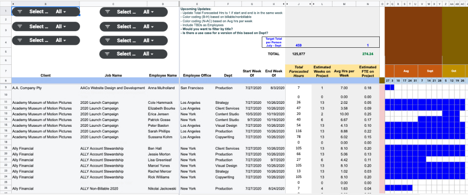
A sample of the different types of external spreadsheets used.
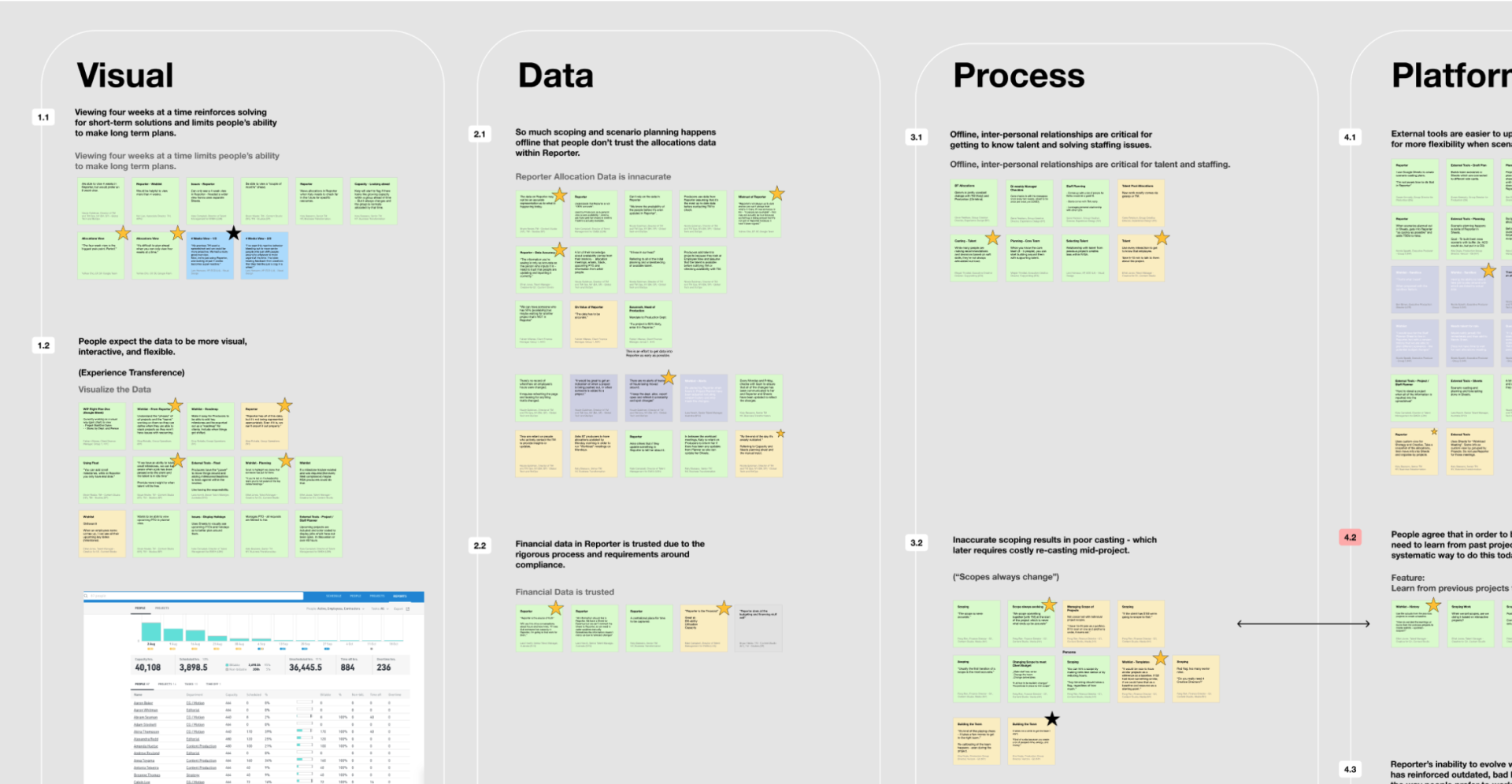
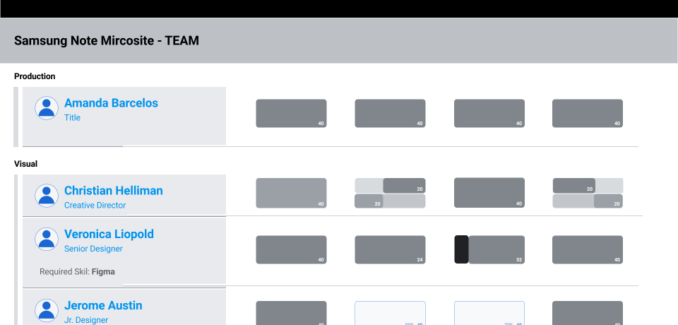
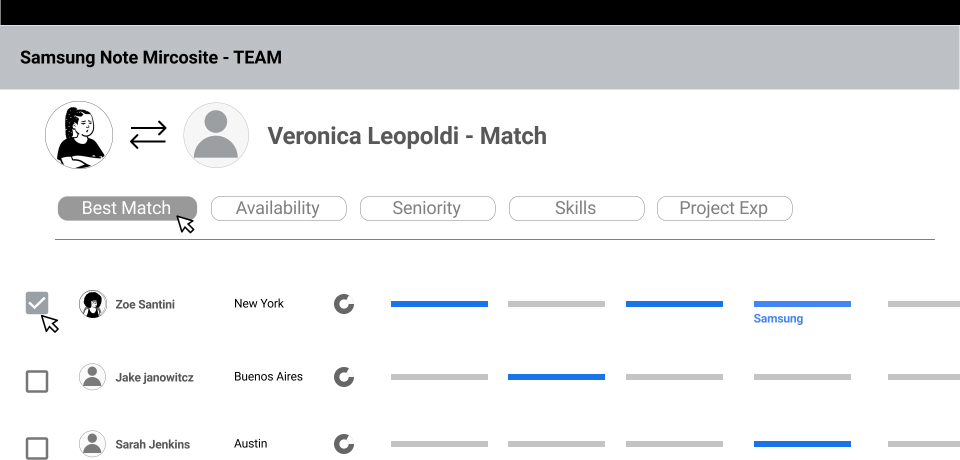
Design Journey
To make the interface easier to use, we explored new designs and interaction patterns.
We integrated the beneficial features from external spreadsheets with familiar patterns from the original app.
Working closely with users and stakeholders, our design team engaged power users early and iteratively validated design decisions.
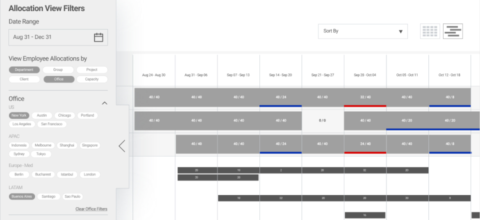
Higher fidelity designs & interactive prototypes.
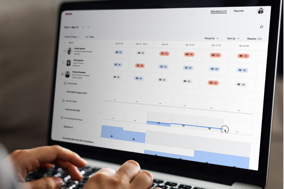
Launch
Reporter Allocations!
A simpler, fast, more human experience.
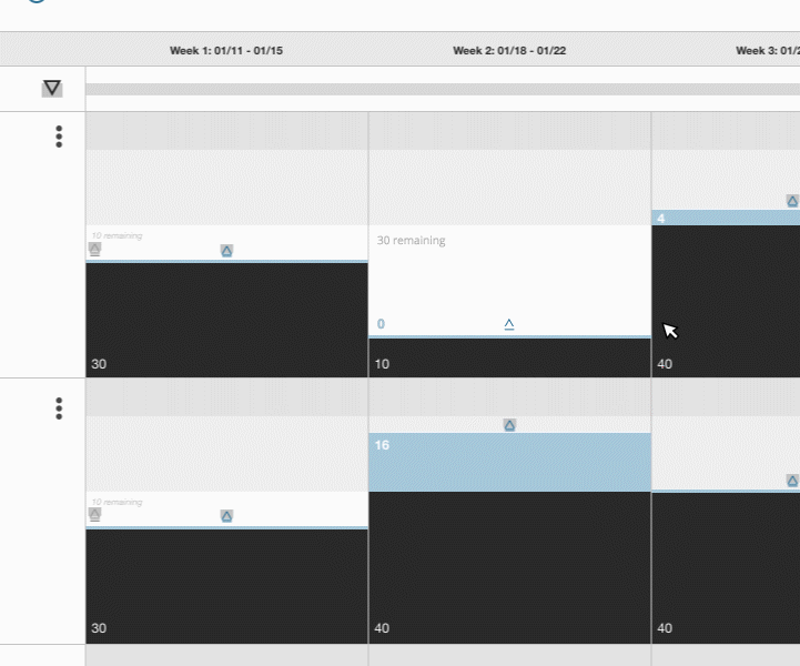
Easier to scan.
A new data visualization language (inspired by the old app) plus some modern spacing makes it easier for Talent Managers to quickly spot the areas that need urgent attention.
Impact
User satisfaction scores increased across nearly all core product features!
Users were no longer relying on their external spreadsheets! They were iterating and working directly in the application ensuring that Talent Managers around the globe could get accurate allocations data whenever they needed to.
+14%
Average increase across all features.
+28%
Managing allocations over a long period of time.
+23%
Finding information about a specific employee.
More


About me
Lorem ipsum dolor sit amet, consectetur adipiscing elit. Suspendisse varius enim in eros elementum tristique. Duis cursus, mi quis viverra ornare.
Freelancer
Illustrator & digital designer
2022 - Now
Lighthouse
Sr. Digital Designer
2018 - 2022
Urban Nest
Jr. Designer
2015 - 2018
Green Haven
Designer Intern
2014 - 2015
